Introducing the DHCSS Stakeholder Map workflow (part 1)
In this series of blogs, we share the data workflow and development process used to collect and visualise data for the DHCSS Stakeholder Map project. The focus is on Digital Humanities (DH), Computational Social Sciences (CSS), and related activities and initiatives in South Africa.
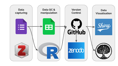
The aim of collecting the data is to provide deeper insight into the breadth of activities in South Africa. The map will facilitate enhanced networking and collaboration, and support the optimal use of resources (e.g. it could help researchers looking for collaborators or potential students wanting to identify training programmes, and it could highlight gaps and opportunities to funders and institutions, amongst others). For this project, Open Source and/or freeware tools were used as shown in Fig 1 and Table 1. These tools were chosen for various reasons (see Table 1). We also evaluated the possibility of being able to integrate them into an automated workflow. Furthermore we wanted to develop a open workflow to faciltate re-use in other domains, countries, and regions.
Requirement
To capture data with a Google Form, and then create data visualisations in Kumu and Shiny through a non-interactive automated process (Fig 1).
Data Pipeline Outline
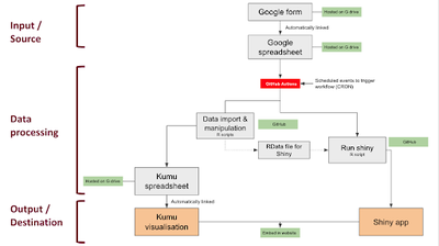
The overview of the data pipeline is shown in Fig 2. The basic outline is to read data from a Google Form linked to a Google Spreadsheet into R, do some data manipulation and tidying into a format for a Kumu ready spreadsheet, then write this data to a different Google spreadsheet. This Kumu spreadsheet is then linked to Kumu for the visualisation. Similarly, an R script imports data from the Google Form linked spreadsheet, does data manipulation, and writes this to a RData file for the Shiny app. This whole pipeline needs to run in a non-interactive and automated way because we expect new data will be uploaded from time to time and we want the visualisations to always show the latest data. GitHub Actions were therefore developed to run this automation.
Blogs in this series:
- Blog 1: Understanding the lay of the land: the DHCSSza Stakeholder Map Project
- Blog 2: Introducing the DHCSS Stakeholder Map workflow
- Blog 3: Setting up the authorisations needed to read from Google Sheets
- Blog 4: File encryption, and automation with GitHub Actions
- Blog 5: GitHub Action for deploying a Shiny app.
For more information on the Stakeholder Map project, please visit our visualisations or the detailed description.